A brand built on calm
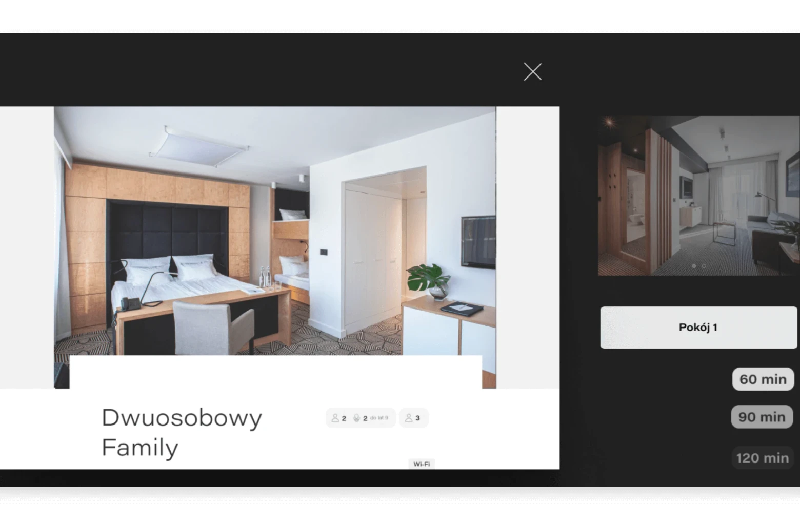
As creative director, I chose the tagline “The strength of tranquility”, for a place with everything a guest needs to recover, relax and feel at home. To keep the brand coherent everywhere, from a single Instagram post to the building itself, we worked from detailed benchmarks and moodboards that set the design patterns and art direction for all media. Instead of stock photography, we ran several multi-day photo shoots of our own. Separate content campaigns on social media brought thousands of followers to SHUUM’s own channels.

Why a booking engine of its own
Once custom software had proved its operational and economic value for the hotel, our scope grew to a booking engine built from scratch. Unlike a subscription product, it could keep developing with the hotel. Research started with a map of how the existing engine worked and where it failed, benchmarks of custom and generic tools, and a review of scientific studies on hotel booking UX. In-depth interviews with SHUUM’s founders and staff mattered most. We also shadowed hotel guests, following their routines and habits in daily life, and ran satisfaction surveys for quantitative data. Two goals came out of it: take work off the reservations desk, and let guests arrange and control their whole booking online.
From map to tested prototype
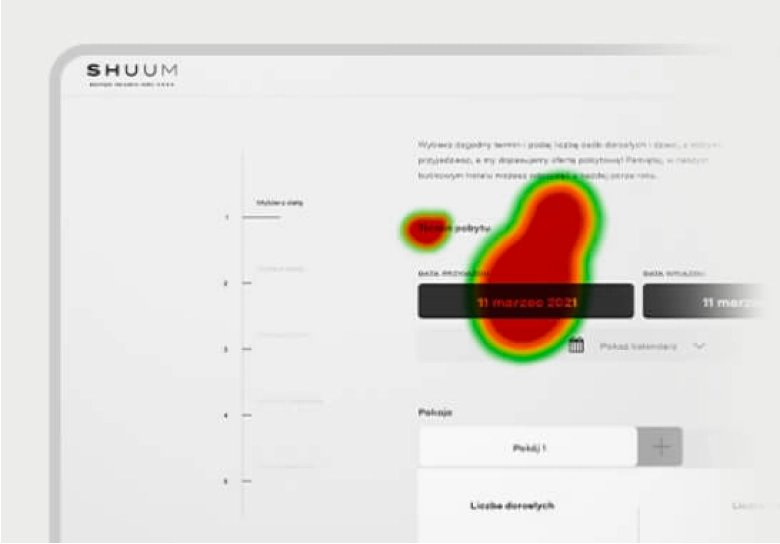
Our strategy team prepared a map of user activities and the information architecture. From them we built an interactive prototype in Axure RP, so it could be properly tested with users at AF.lab, our agency’s research lab. Each session had instructions, eye-tracking tasks and an in-depth interview. We recruited a focus group by targeted selection to match a cross-section of the hotel’s potential guests, women and men aged 36 to 69, and with our own lab we could run the tests despite the pandemic. Comparing areas of interest showed the key elements of the booking process, and the results improved the final design.
The final design
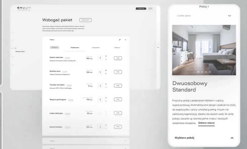
In the final design, a clear structure and precise microcopy guide guests through every step. Extras can be added while booking, and everything about the stay sits in one place.