Selected projects, mostly software for specialists, chosen to show how I work from research to interface. Some are under NDA, so their descriptions are brief and their screens blurred.
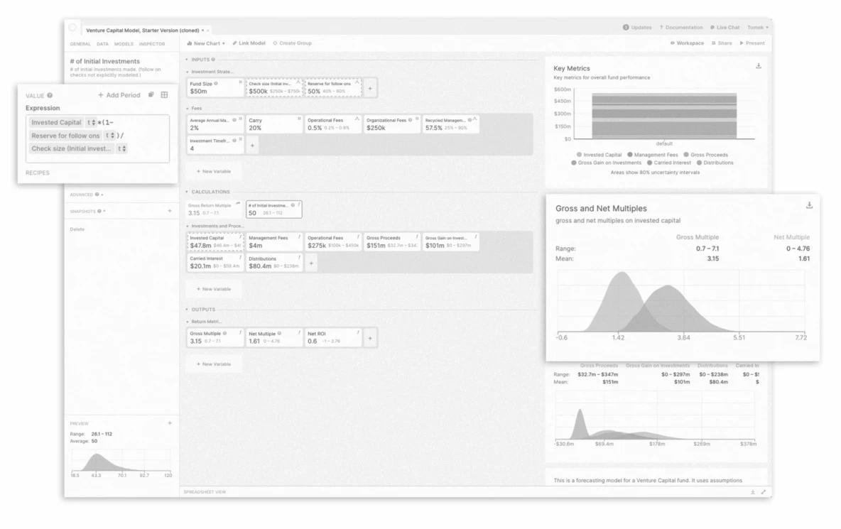
Causal (now part of Lucanet ↗ (opens in a new tab)) is a platform for financial modeling, planning and interactive reporting, built to replace spreadsheets and static slide decks. I worked on its information architecture and core interface, so that people with different backgrounds could understand and use it.
my part
Interaction flows, prior art, interface explorations, final UI
together
Research with Causal’s creators and first users, product logic, a roadmap of next steps
Fig. 1 -- Earlier model: each variable as a separate card.
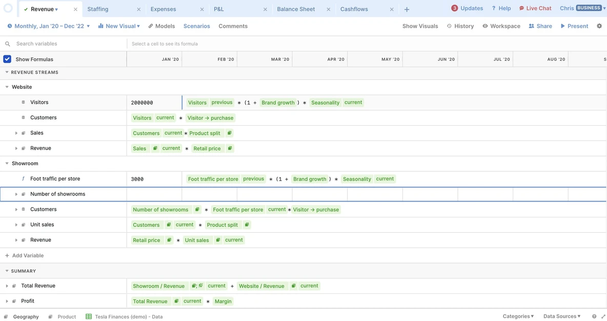
Fig. 2 -- Revised model: variables in rows, values over time, formulas edited in place.
Causal is a tool for financial modeling and simulation. It gives simple access to Monte Carlo simulation but breaks the conventions of the familiar spreadsheet, so despite a clean interface and many tutorials, people used to spreadsheets could feel lost at first. The main challenge was to understand their mental models across many use cases and to answer them with new interface solutions.
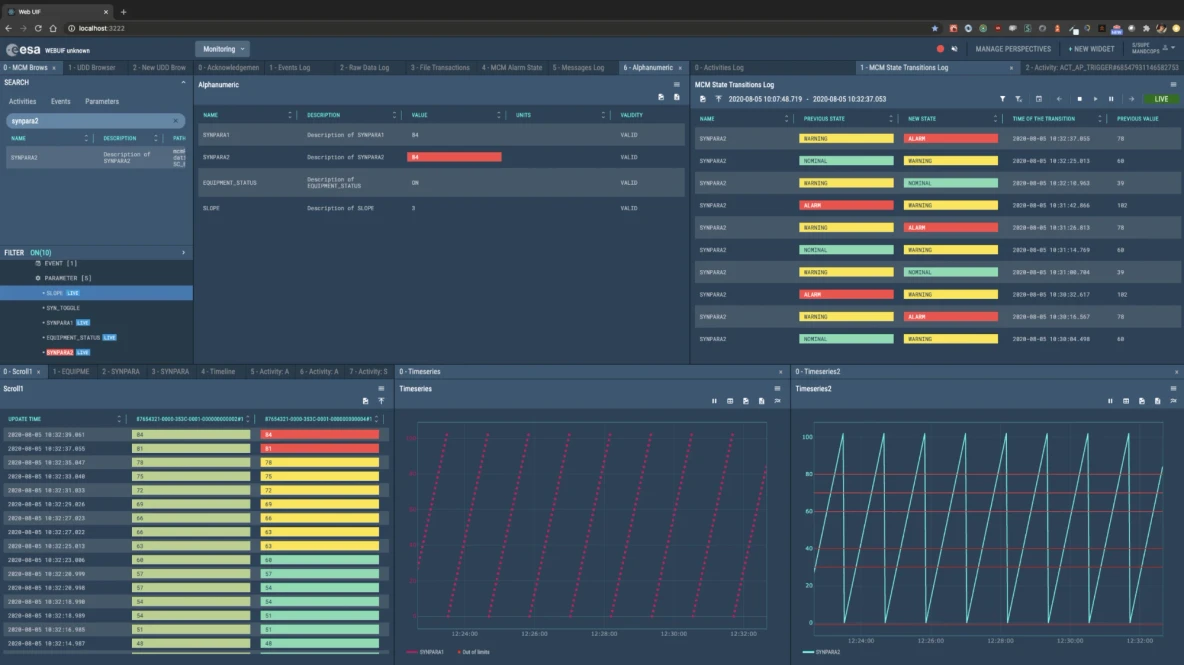
The BitByBit Company builds ground-segment software for European Space Agency ↗ (opens in a new tab) projects: the systems used on Earth to prepare, test and run space missions. I design a web-based version of an existing interface for mission operators, from on-site workshops and research to interactive prototypes. I also take part in adapting the agency’s design system for accessibility.
my part
On-site UX workshops, operator research, views and interactions, static and interactive prototypes
together
Domain rules and technical constraints, with BitByBit’s teams
Fig. 1 -- A web interface for ground-segment operators, from BitByBit’s public materials (2020). Image: ESA.
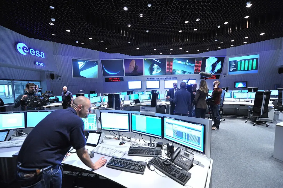
Fig. 2 -- The main control room at ESA’s European Space Operations Centre in Darmstadt. Photo: ESA.
Mission operators are highly trained experts, and the software they rely on is mission-critical. A web version has to keep all of its functions while giving information and operator actions a clearer, more consistent form. The hard part is not the look of the screens but understanding the domain and how operators actually work.
Diagnostic labs are planned around throughput: how many samples the instruments can process and how quickly results come back. I design new tools for an environment that simulates how a lab works, where specialists prepare data, configure scenario variants and compare the results.
my part
Research and tests with experts, information architecture, interaction logic, static and interactive prototypes
together
Domain objects and rules, worked out with experts and the product and engineering teams
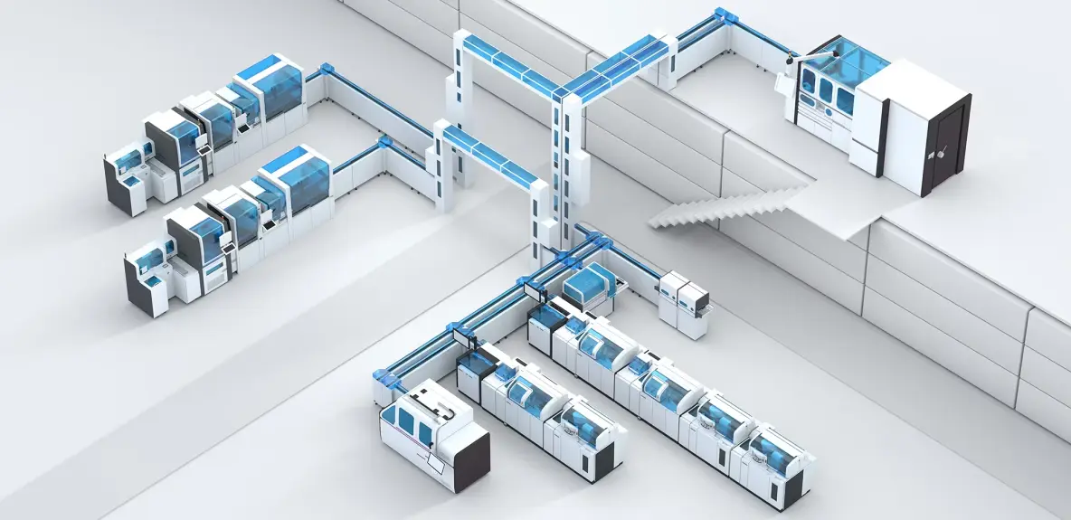
Fig. 1 -- An example of a simulated lab in its final 3D render: analyzers linked by sample transport lines.
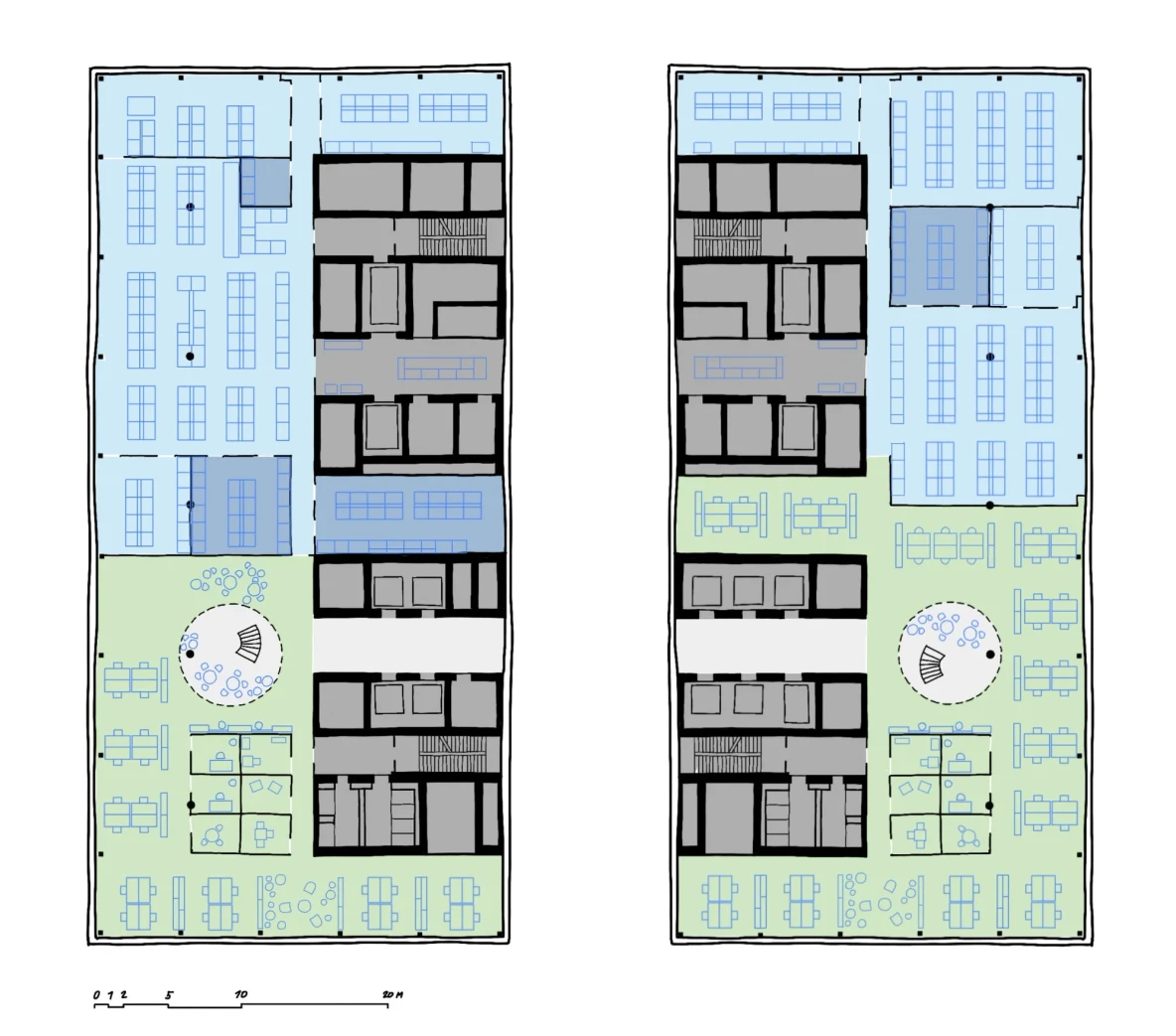
Fig. 2 -- A 2D lab floor plan made in Autodesk Revit. Flow simulations are built on plans like this one.
A simulation is only useful if specialists trust what goes into it and can see why the results change. The interfaces have to show how input data, configuration, constraints and results depend on each other. That way people can spot inconsistencies, understand what a change does and try another variant, whether they are comparing throughput scenarios or routes for samples through the lab.
Molecule.One ↗ (opens in a new tab) is a computational chemistry company. It uses machine learning to predict the best ways to synthesize molecules, a crucial step in creating new drugs and treatments. I worked on the UX concept and interaction logic for browsing and comparing the synthesis routes it proposes, so chemists can narrow hundreds of routes down to the few worth comparing.
my part
UX concept, interaction logic, user flows, wireframes
together
Data explorers and code prototypes, user tests with chemists
patent
Part of a larger system described in a US patent application
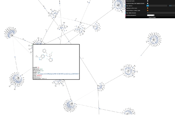
Fig. 1 -- Code prototype: every proposed route for one target molecule as a zoomable graph.
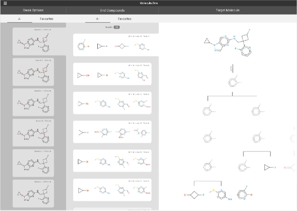
Fig. 2 -- Final proposal: ways to cut the target molecule, matching starting materials, the resulting synthesis tree.
Molecule.One asked flow/control for help after its debut at TechCrunch Disrupt SF 2019, where it showed an early version of the interface. Chemists enter the structure of the organic molecule they want to produce, and the software searches a hypertree of possible compounds and pathways. Users could browse hundreds of possible pathways, but it still took too long to find the right one -- doable, cheap and as simple as possible.
Buyers of a new Volkswagen usually wait about six months for their car, sometimes up to a year. Discovery Space was designed to make that wait less frustrating, and I led its UX and creative direction, from user research to a prototype tested with users.
my part
UX and creative direction, information architecture, user flows, wireframes
together
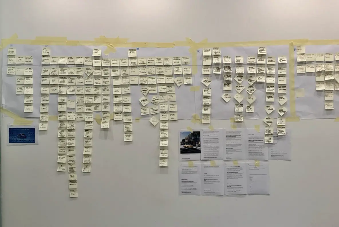
Research and interviews, scenario map, a workshop with Volkswagen’s team
validation
Focus group tests with eye-tracking and GSR (galvanic skin response), which checked what people had said in interviews
Fig. 1 -- User scenario map: personas and the jobs new owners need done, turned into requirements.
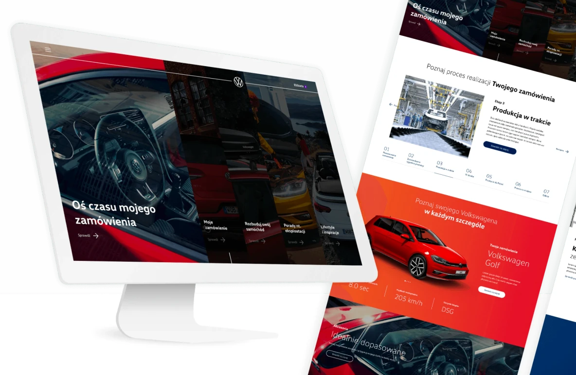
Fig. 2 -- High-fidelity design: the order timeline in seven stages, from processing to pickup.
Volkswagen came up with the idea of a virtual space where customers could get precise information about the current stage of production, preview purchase documents, discover brand and educational content, or get rewarded for a long wait. We were asked to develop it bottom-up, grounded in a deep understanding of user needs.
SHUUM is a boutique wellness hotel on the Polish Baltic coast. Over three years, it got a new name, brand, website and its own booking system, where guests can plan the whole stay, extras included. I wrote the brand strategy and main creative concept and set the direction of the identity. I also led the UX of the website and the booking system, from research to design validation.
my part
Brand strategy and creative concept, identity direction, website information architecture and UX
together
The name, booking system design, from prototypes to test analysis
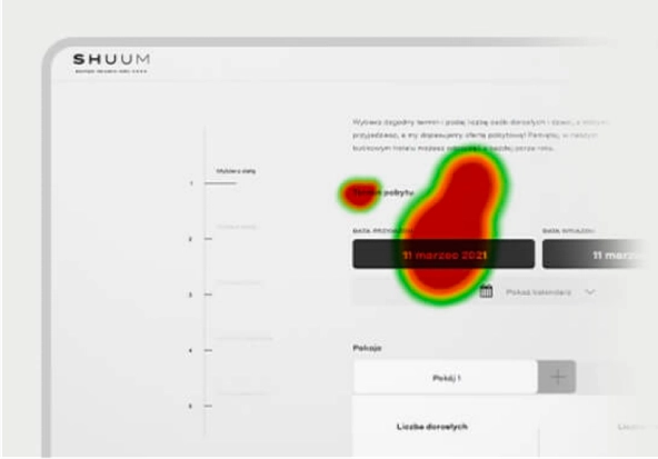
Fig. 1 -- Prototype test at AF.lab: eye-tracking heatmap on the date picker.
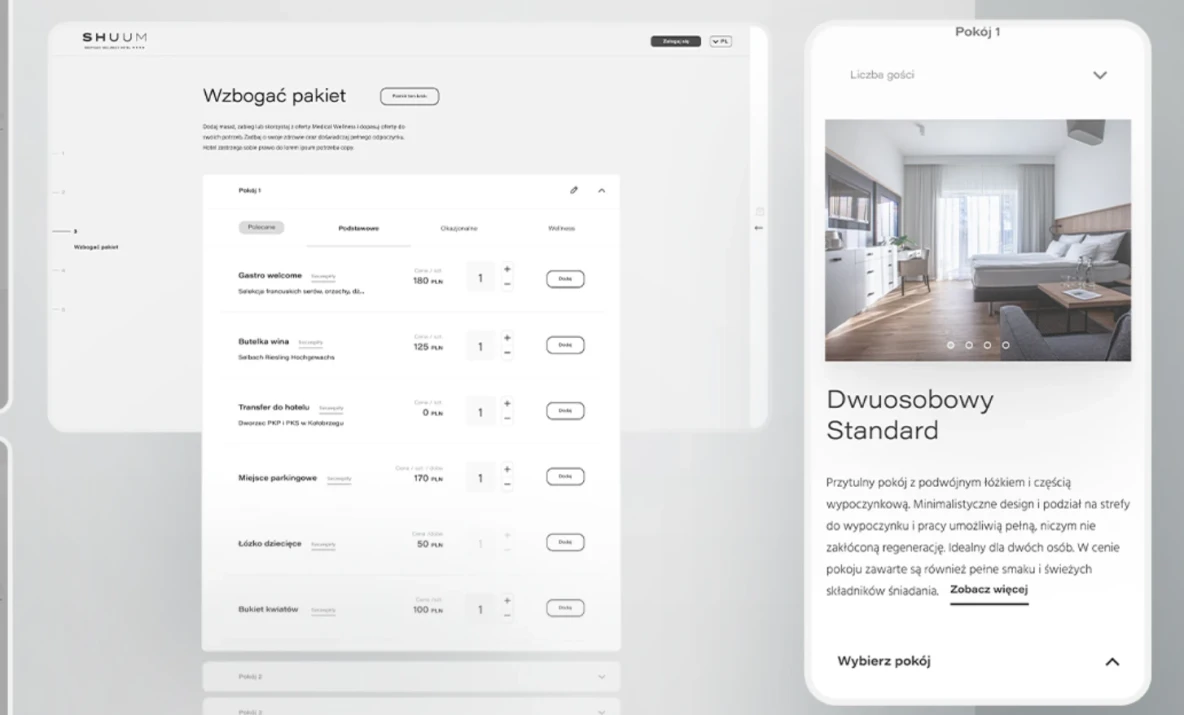
Fig. 2 -- Final design: guests add extras to each room while booking, on desktop and mobile.
The rebranding started with the name. In workshops we went through nearly 400 proposals before choosing SHUUM: a quiet, voiceless sound, like the waves breaking 100 meters from the main entrance. The logotype carries the same calm, with wide spacing that suggests air and space.