Who is waiting
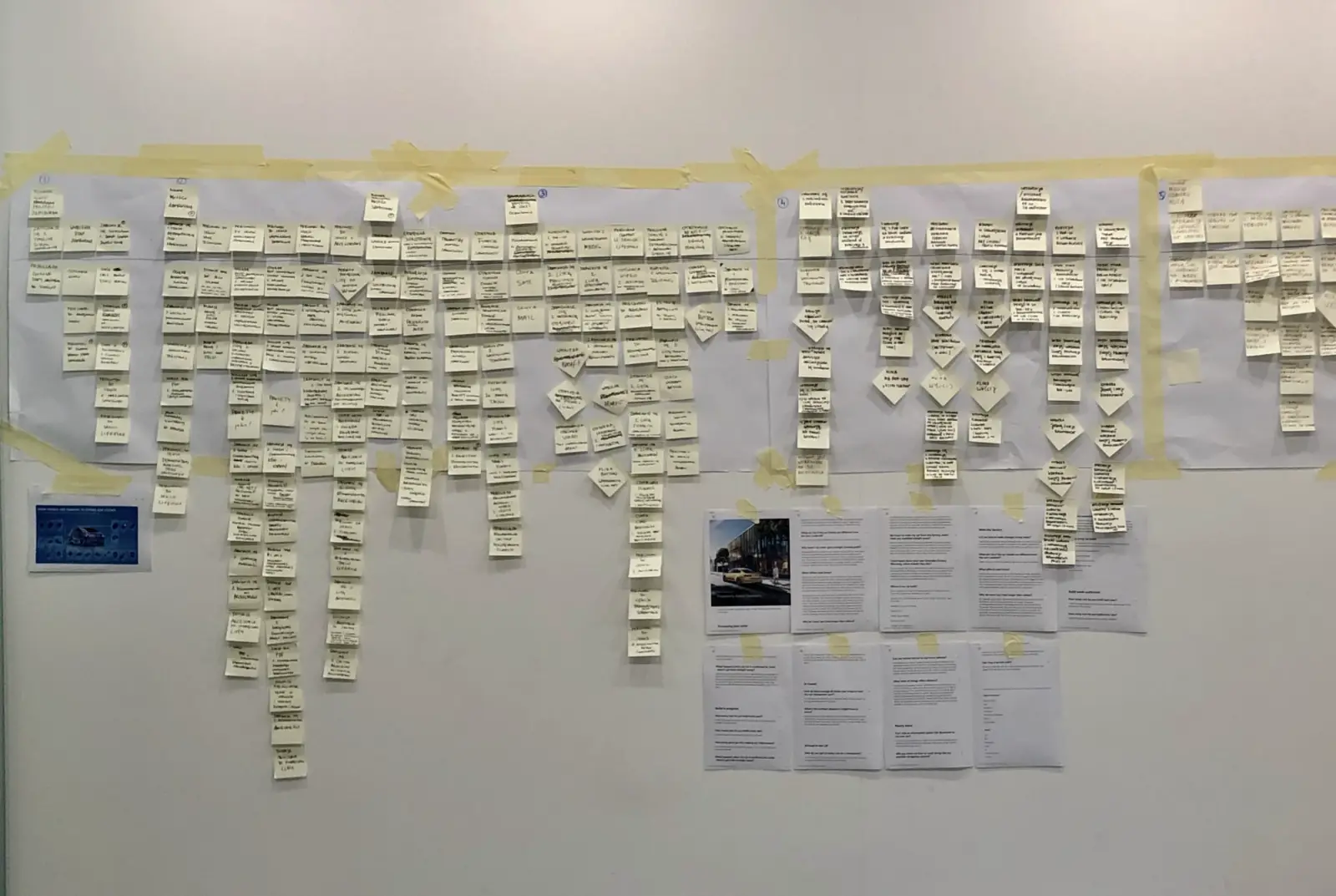
To create a rewarding experience for frustrated customers, we needed to understand their behavior and mood during the wait, how they spend time online and what gives them satisfaction there. Our research started from Volkswagen’s buyer personas; with analytics tools such as Facebook Audience Insights, SoTrender and Brand24 we ran further studies to understand their motivations and lay the groundwork for personalization. Six additional interviews brought out more detailed pain points. Together they led to 12 jobs the platform had to do; matched with each persona, they gave tens of user scenarios, each turned into functional requirements on one large scenario map.
An architecture that changes with the wait
The information architecture came from user-story mapping and the requirements behind each scenario. At its core was an onboarding questionnaire, rewarded when filled in, that told us which persona we were dealing with. Each element came with notes on how a given persona should see it, and with time frames that unlocked actions once the wait passed critical points. We also kept navigation to a minimum, so content was always at hand and paired with clear actions.
From sketches to flows
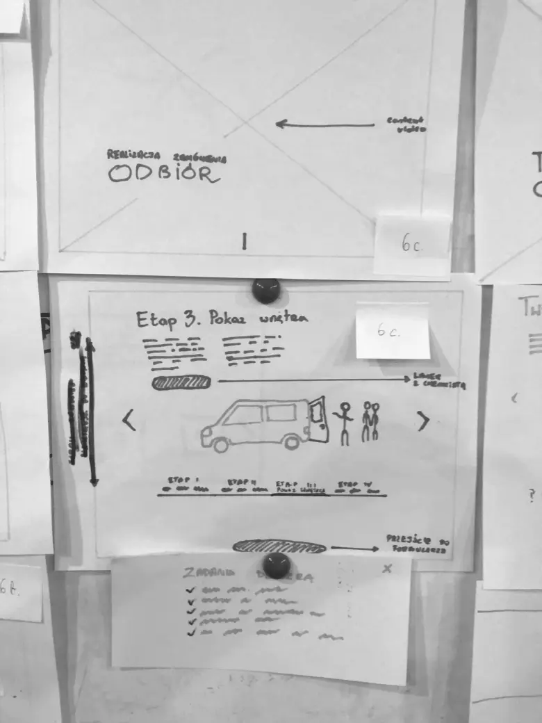
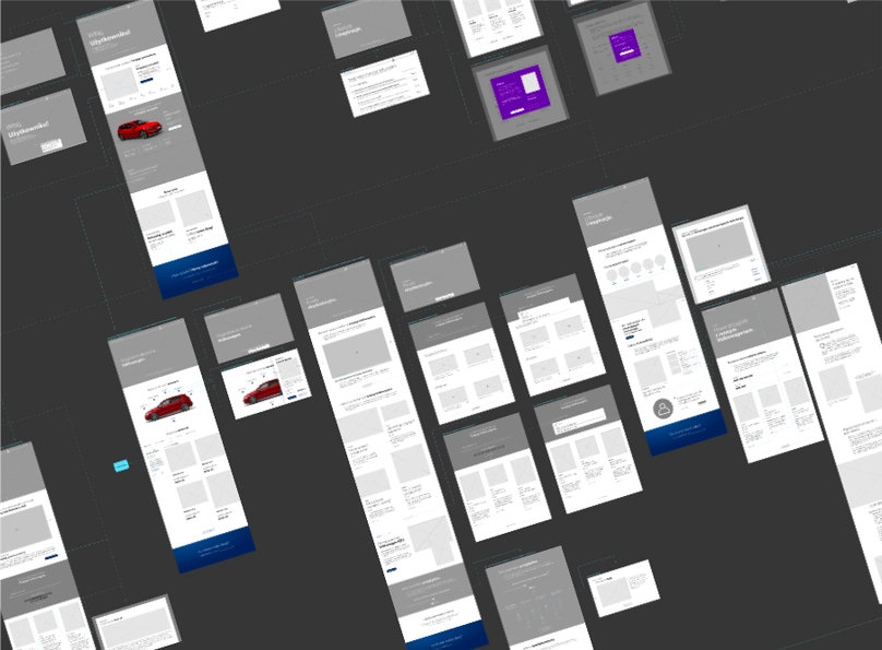
With the architecture in place, we moved to low-fidelity wireframes. A working group of a graphic designer, two UX researchers, a developer and the product owner produced hundreds of sketches in brainstorming sessions; each was matched with requirements and given its pros and cons. Anyone in the group could vote for their preferred option, and the product owner confirmed the choice. From the approved sketches we made mid-fidelity wireframes, linked them into user flows and held a workshop with Volkswagen’s team to test our assumptions and gather feedback from all stakeholders.
The prototype, tested
Finally, we gave our graphic team a hand-off with the information architecture, user flows, mid-fidelity wireframes and strategy documents. The clickable prototype came together quickly and without costly changes. We then tested it with a focus group, using eye-tracking and GSR (galvanic skin response) to check the answers people had given in interviews.